Good Evening!
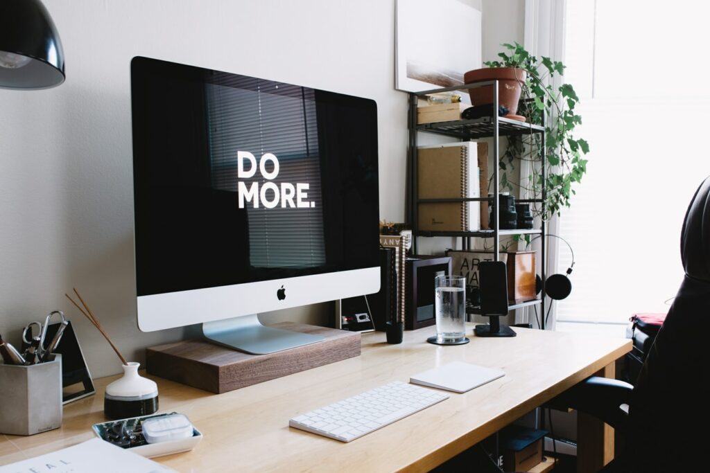
You may have noticed the hot new hero image on Legiit
If not well… here it is!

We made this change for a couple reasons. The first is, that it is just nice to freshen things up from time to time.
The other however was based on data. We have a heatmap software on the site that tracks people’s behavior. What we found was that under the old layout that a large% of the traffic never scrolled and just stopped at the hero image or slightly below. Now some of that was people logging in or registering, but it also meant that a lot of people were never seeing any services. So obviously that is huge.
In my experience people either spend too much or too little time on things like this. Some people will throw up a site, and if THEY like it that is the only decision that matters to them. Conversely others will have a terrible product that no one will buy but spend tons of time testing different font colors trying to squeeze 1% more conversion out of a site. I feel like we have a great product with Legiit, so now we can start testing smaller variables like this to improve the user experience and thus the conversions and sales. We will keep making changes and I will keep updating everyone on the progress so you can hopefully implement it into some of your sites.
Let me know if you have any questions.
Best,
CMW

